During the protests across the United States following George Floyd’s killing in May 2020, “Black Lives Matter” murals were painted on streets in various cities around the country. There was also one in Portland, Oregon, on N Edison Street (It has a website: https://www.edisonstreetmural.com/).
One interesting aspect of the mural on Edison Street is that in addition to the usual “Black Lives Matter” in large yellow letters, it also includes brief snippets of history related to the neighbourhood written into each letter. I rather like the idea. It is no longer just a slogan, but also educates and tells a story. The Edison Street mural’s website has more information on each of these stories.
The small writing in a big mural poses a challenge for photographing it. An aerial photo from a drone would capture the entire mural, but would be too far to see the writing. Photographing up close can capture the writing, but is too close to see the big picture. I thought it would be possible to take many pictures up close then stitch them together, to get both the overall picture and details in a single image. Below is the result — A 2.7-gigapixel image.
This composite image was taken over two separate days (2020 June 28 and July 25), because there were some changes to the mural after my first set of photos. Due to laziness, I only photographed the modified portions on July 25. I also added some more of the grass above and below the main text during my second visit. In the final composite, there are 183 photos from June 28, and 434 photos from July 25.

The panorama is a composite of photos taken June 28 (green, 183 photos) and July 25 (purple, 434 photos)
Photographing and Stitching the Panorama
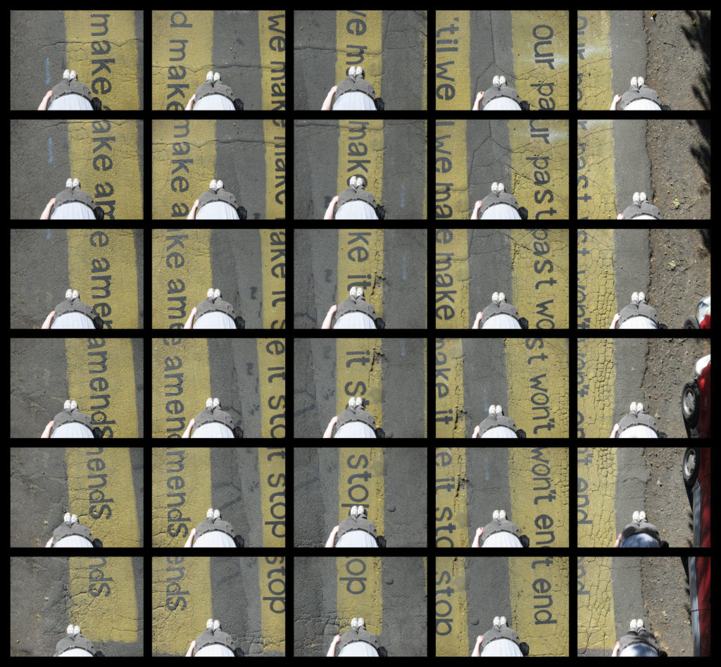
Photos were taken with a Canon S95 (10 megapixel), hand-held, pointing approximately down. The photos are taken with enough overlap between photos to avoid any gaps, even after masking out the region blocked by my feet. Below is an example of 30 photos from a small portion of the mural.
The photos were then stitched using Hugin. This took a lot of effort (weeks). Control points (pairs of points on different images that mark the same real-world point) are added between pairs of overlapping images, then an optimizer (gradient-descent based?) is run to find a transformation of each photo to make the control points line up as closely as possible.
While stitching panoramas of a few tens of pictures is easy, long panoramas more than a hundred photos wide is more difficult. Any errors in aligning adjacent images accumulate over the length of the panorama and the panorama no longer remains straight. Artificial constraints were added to straighten it. There are small alignment mismatches between images. When the mismatches occur within the small text, they are very noticeable and require manual adjustment. On top of that, just the sheer size of the panorama means there are many images to stitch (over 600), with many control points (about 37,000), and every operation is slow.
After seeing the mural in the news, I went to take pictures without yet knowing how to stitch them. This resulted in taking a set of photos that were harder to stitch than necessary.
- Adjacent photos should have a large (50%?) overlap. Stitching photos requires finding control points, and the automatic algorithms to do this don’t work when the overlap is too small. For the first set of 285 photos, I ended up adding most of the control points by hand because there was not enough overlap. Having realized my mistake, the additions on July 25 had more overlap, with 305 new photos to replace an area about one-third of the original, which allowed most of the control points to be found automatically. Sadly, I made the same mistake again when photographing the top and bottom edges (139 images) thinking that I wouldn’t care much if the grass and gravel areas didn’t align as well as in other parts of the mural. That may have been true, but I had to add all the control points manually again.
- If there are small regions that would be ugly if misaligned, try to include the entire section in one photo to avoid or reduce the number of seams in highly-noticeable areas. If a paragraph of text can fit entirely within one image, the seam can be outside the text and be less noticeable. Failing that, a seam between two lines of text is less noticeable than a seam that cuts in between words of the same line, which is better than cutting between letters of the same word.

Leave a Reply